03
Marketing Collateral, Campaigns & Packaging
Marketing Collateral, Campaigns & Packaging
Marketing Collateral, Campaigns & Packaging
This is where strategy meets good-looking design. From pitch decks to promos, social assets to print pieces, I craft the visuals that help ideas land and brands speak fluently. Whether it’s making data feel friendly or turning a one-pager into a page-turner, I’m all about making communication actually... communicate.
FEATURED CLIENT 1
JERRY WIPER
FEATURED CLIENT 2
SOUNDING BOARDS
KEY DELIVERABLES
PACKAGING, POSTERS, MERCH
YEAR(S)
2020-2024
JERRY WIPER
Marketing Collateral, Campaigns & Packaging
WHAT I DO
I bring brands and campaigns to life through bold, cohesive visuals that span print, digital, and physical formats. Whether designing a packaging system or creating a full-funnel launch campaign, I aim to communicate clearly, connect emotionally, and drive impact at every touchpoint.
I bring brands and campaigns to life through bold, cohesive visuals that span print, digital, and physical formats. Whether designing a packaging system or creating a full-funnel launch campaign, I aim to communicate clearly, connect emotionally, and drive impact at every touchpoint.
Integrated brand and product campaigns
Marketing collateral (brochures, posters, mailers, sales decks)
Print and out-of-home advertising
Packaging systems (product, retail, unboxing experiences)
Social and digital ad creative
Integrated brand and product campaigns
Marketing collateral (brochures, posters, mailers, sales decks)
Print and out-of-home advertising
Packaging systems (product, retail, unboxing experiences)
Social and digital ad creative

JERRY WIPER
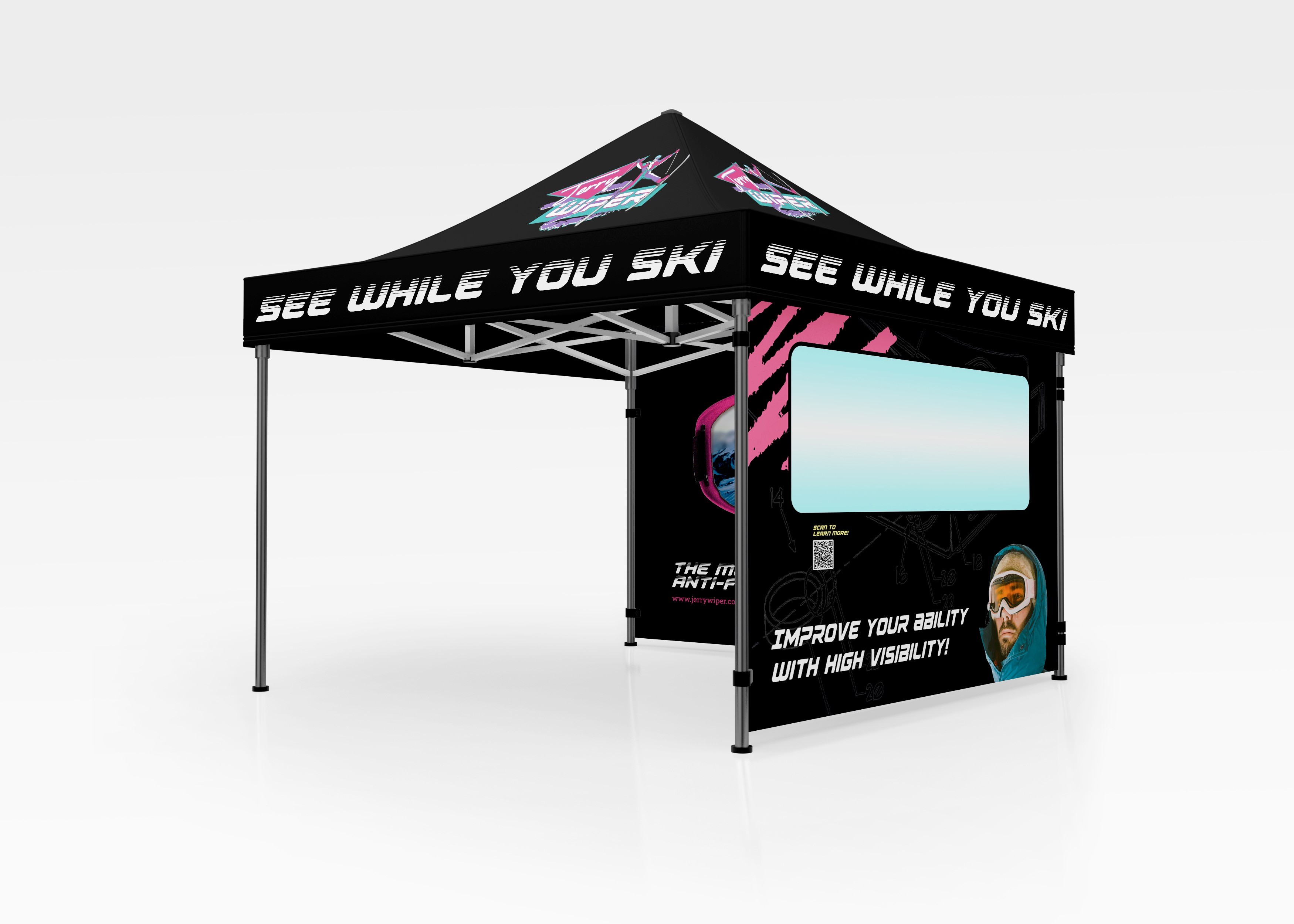
The Jerry Wiper is a clever ski accessory invented by Lila Adler, a young innovator with a sharp eye for solving real-world problems on the slopes. I translated her vision into a bold, energetic brand system, designing playful, functional packaging, expo materials, and an attention-grabbing tent experience that brought the product to life in a high-traffic physical environment. While the logo existed, the brand needed depth, cohesion, and personality. I developed a visual identity rooted in nostalgic charm and clever utility, aligning closely with Lila’s inventive spirit. The campaign materials, including branded collateral and expo assets, helped Jerry Wiper stand out at the GoPro Mountain Games in Vail, CO, where the product drew strong crowd engagement, significant pre-orders, and retailer interest. This cohesive and strategic rollout positioned the brand with clarity and confidence, sparking momentum that led to a Shark Tank interview and opened conversations around broader scalability. From packaging to in-person brand touchpoints, the work served as a foundation for fast traction and early-stage success.
The Jerry Wiper is a clever ski accessory invented by Lila Adler, a young innovator with a sharp eye for solving real-world problems on the slopes. I translated her vision into a bold, energetic brand system, designing playful, functional packaging, expo materials, and an attention-grabbing tent experience that brought the product to life in a high-traffic physical environment. While the logo existed, the brand needed depth, cohesion, and personality. I developed a visual identity rooted in nostalgic charm and clever utility, aligning closely with Lila’s inventive spirit. The campaign materials, including branded collateral and expo assets, helped Jerry Wiper stand out at the GoPro Mountain Games in Vail, CO, where the product drew strong crowd engagement, significant pre-orders, and retailer interest. This cohesive and strategic rollout positioned the brand with clarity and confidence, sparking momentum that led to a Shark Tank interview and opened conversations around broader scalability. From packaging to in-person brand touchpoints, the work served as a foundation for fast traction and early-stage success.

THE RESULTS
THE RESULTS
PREORDERS
PREORDERS
1500
1500
1500
IG FOLLOWER GROWTH
IG FOLLOWER GROWTH
x5
x5
x5
STOKES SENT IN SKISON
STOKES SENT IN SKISON
100%
100%
100%
From scrappy street promos to full-blown campaign rollouts, I create marketing collateral that knows how to show up and make noise. Whether it’s packaging, digital assets, or print pieces, I like building systems that feel cohesive but never too polished to play. Pictured here: a set of wheatpaste posters for a local musician’s debut album: gritty, eye-catching, and designed to stop someone mid-walk with a "wait, what’s that?" moment.
From scrappy street promos to full-blown campaign rollouts, I create marketing collateral that knows how to show up and make noise. Whether it’s packaging, digital assets, or print pieces, I like building systems that feel cohesive but never too polished to play. Pictured here: a set of wheatpaste posters for a local musician’s debut album: gritty, eye-catching, and designed to stop someone mid-walk with a "wait, what’s that?" moment.

Making things people want to keep, click, or steal from hotel lobbies.


SOUNDING BOARDS
Sounding Boards began as a justice and unity-focused initiative in response to the Black Lives Matter demonstrations of 2020. Nearly overnight, I created the brand from the ground up— coming up with the brand name, designing the logo, identity system, website, social media presence, and business model with little but inspiration within. As co-founder and creative director, I led the development of a clear, mission-driven visual language that could adapt across platforms and grow with the organization. Our brand voice and identity served as the foundation for all outreach efforts from fundraising and press materials to artist communications and public-facing content. This strategic, cohesive design system helped us raise over $60,000 in donations and successfully activate national media attention both nationwide and globally, culminating in an hour-long keynote I delivered to a global audience of thousands of designers and architects. Every visual touchpoint was crafted to center equity, amplify local artists, and reflect our commitment to repair and representation.
Sounding Boards began as a justice and unity-focused initiative in response to the Black Lives Matter demonstrations of 2020. Nearly overnight, I created the brand from the ground up— coming up with the brand name, designing the logo, identity system, website, social media presence, and business model with little but inspiration within. As co-founder and creative director, I led the development of a clear, mission-driven visual language that could adapt across platforms and grow with the organization. Our brand voice and identity served as the foundation for all outreach efforts from fundraising and press materials to artist communications and public-facing content. This strategic, cohesive design system helped us raise over $60,000 in donations and successfully activate national media attention both nationwide and globally, culminating in an hour-long keynote I delivered to a global audience of thousands of designers and architects. Every visual touchpoint was crafted to center equity, amplify local artists, and reflect our commitment to repair and representation.
© HUNTERCAMILLE.COM
© 2025